Master the Art of Reporting: A Deep Dive Into Salesforce Report Customization Options
Hey there, Salesforce whizz-kids! If you're here, it means you're prepping for the Salesforce Certified Administrator exam (whoop, whoop!) or simply are inquisitive souls wishing to level up your Salesforce game. This post is your golden ticket to the magical world of reports in Salesforce - a pivotal role that any Salesforce admin must master to prove their worth.
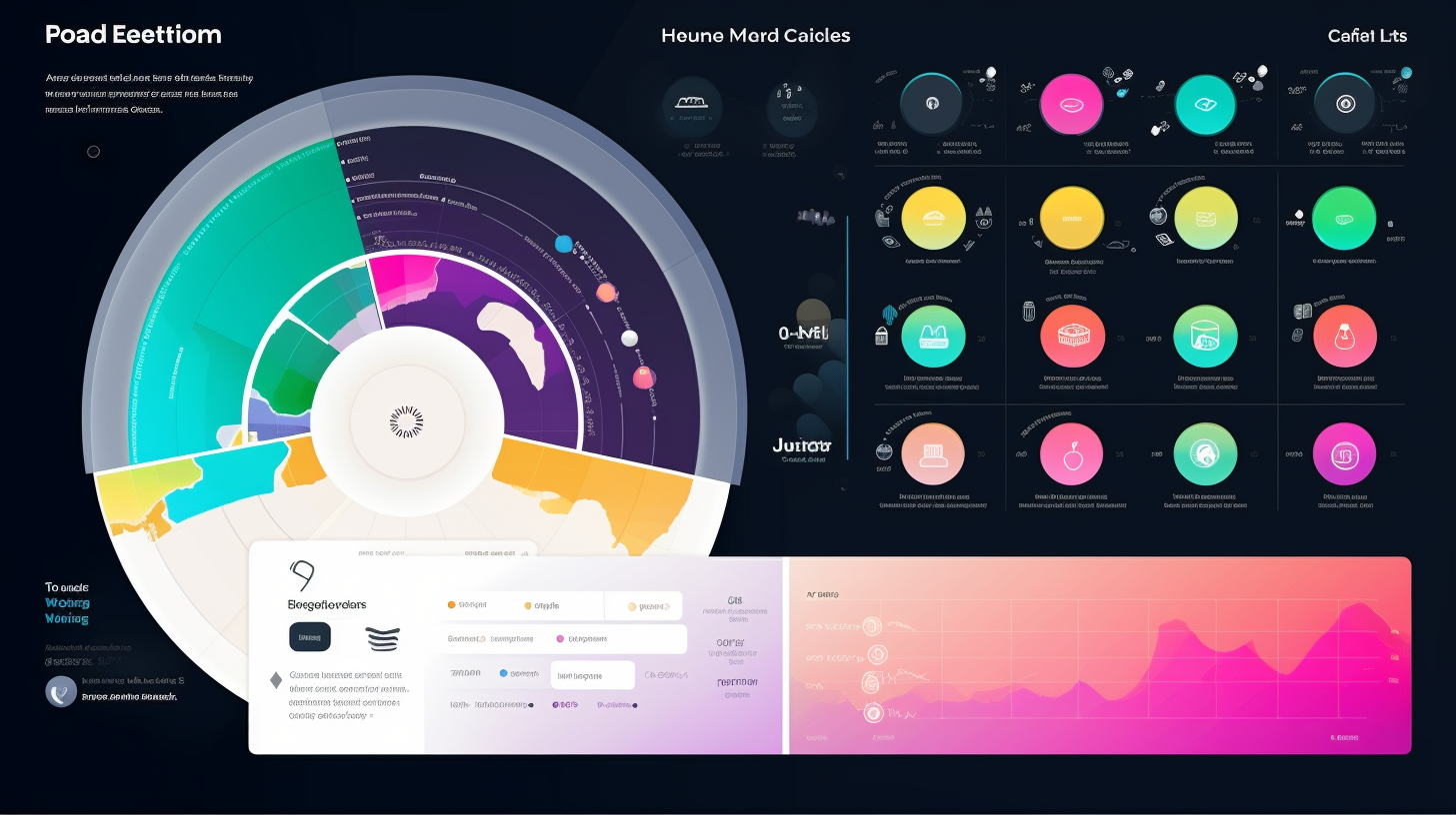
Making sense of data, tracking performance, and making correct business forecasts are at the heart of any able administrator. And when we talk about Salesforce, the report customization options are the superpowers that let you do precisely that. Buckle up, as we're about to embark on a roller coaster ride through report types, report formats, fields, data summarization, filtering, charting, scheduling, and the cherry on top – conditional highlighting!
The Mighty Report Types
The first step to harnessing the power of reports is picking the right report type. Now, you might be wondering, 'what's the big deal about report types?' Well, they are essentially your map for data navigation. They define how records are related and what fields are available. Reports in Salesforce come in four different flavors: tabular, summary, matrix, and joined. From creating a basic list with tabular to comparing multiple totals with joined reports, each has its unique flavor and functionality. So, what's right for you? It depends on the kind of answers you seek from your data!
Report Formats – The Form That Follows Function
Next up is the report format. It's the skeleton structure you build your report around, and its purpose is to make sure the data is presented in the most digestible way possible. The report format you select, much like choosing an outfit for a special occasion, will depend largely on the type of data and the kind of statement you want to make. Are you relaying simple statistics? Go casual with a tabular layout. Shuffling through multiple record groups? A summary layout may be your perfect fit. Want to go all out and show relationships among data? Matrix and joined layouts are what you're after!
The Crucial Role of Fields
Fields are the building blocks of any report. Think of them as little data detectives that scour your Salesforce database, collecting the tiniest shred of relevant information. You can customize which fields to include in your report, and each one you add will provide another layer of detail to your data narrative. But remember, just like too many cooks spoil the broth, stuffing your report with unnecessary fields might make it difficult to digest. So, choose wisely!
Summarizing Data – Telling a Story
Ever been to a movie and walked out unable to make head or tail of what you just watched? That's exactly the predicament your users will find themselves in if you don't summarize your data well. Summarizing data allows you to create a narrative that makes sense, guiding your users through the report and revealing key insights. You can group, sort, sum, average, and more, to organize data in a way that tells your desired story. Remember, a well-told data tale is worth more than a thousand raw facts!
Filtering Through the Noise
Filtering data is like having a conversation with a toddler – you have to sift through a lot of babble to get to the gems! Using filters, you can specify and isolate the data that holds meaning for your report. Not only does this save you from a data overdose, but it ensures your report is as relevant and on-point as possible. Whether standard filters, cross filters, or field filters, they all bring accuracy and precision to your reports. Remember, clarity and focus always beat ambiguity!
Charting a Course through the Data Sea
Charts are the visual genies of the Salesforce Report world – they grant the wish of instant understanding! With charts, you can convert rows and rows of monotonous numbers into visually-appealing, easily-interpretable representations. Bar charts, pie charts, funnels, ometer what have you, they're all at your disposal to create a dynamic and colorful report. And let’s admit, when it comes to data, seeing is believing!
Scheduling: Your Very Own Timekeeper
Batch reporting or scheduling, the silent but efficient worker, allows you to set reports on autopilot. This means you can schedule reports to run at specified intervals, say daily, weekly, or monthly. It’s like having a personal assistant who brings you your morning coffee, or rather, your morning data, on time, every time! Scheduling ensures that you’re always up-to-date & never miss out on fresh data findings, while you busy yourself elsewhere.
Conditional Highlighting: The Showstopper
Finally, we've reached the star of the show – conditional highlighting. This jazzes up an ordinary report with color-coding, thus highlighting critical data. It’s like shining a spotlight on the main characters of your data story. Green for good, red for warning, or choose your own color code. This visual cue lets users grasp the importance of data at a glance. Conditional highlighting is the final touch, the icing on the cake, that amps up the effectiveness of your report!
So, there you have it, folks! A thrilling journey into the heart of Salesforce report customization options. Remember, like any great art, mastering the art of Salesforce reports lies in carefully balancing the elements. Pick the right type, use fitting fields, summarize with a purpose, filter smartly, ornament with charts, set alerts with scheduling, and accentuate with conditional highlighting, and voila! You’ve got a masterpiece on your hands. Good luck with your Salesforce Certified Administrator exam, and may the force (or rather, the data) be with you!