Unraveling the Mysteries of Dashboard Configuration in Salesforce: An In-depth Exploration
Well, folks, buckle up! We're about to head on a wild ride through the thrilling world of Salesforce dashboards. No, don't yawn! Dashboards, believe it or not, are the lifeblood of effective business analysis. They are the tools that help convert raw data - a seemingly endless stream of ones and zeros - into meaningful information. When it comes to dashboards, the internationally renowned CRM platform Salesforce performs in the big leagues.
The Nitty-Gritty of Dashboard Configuration
You have a smorgasbord of options to consider when crafting a dashboard in Salesforce. These include dashboard components, data sources, chart types, scheduling, and running user. Shall we take a closer look at these options?
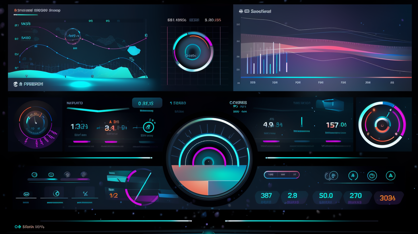
Dashboard components in Salesforce are like the ingredients of a well-baked pie. They include charts, gauges, tables, metrics, and visualforce pages, to name but a few. These elements work in harmony to present data in an appealing and digestible format. Different components serve different purposes – while charts excel in visualizing trends and comparisons, metrics succinctly display key numerical values. You can mix and match these components to suit your taste – or more accurately, your data analysis needs.
Naturally, these components need fuel; they run on data sources. Now, Salesforce gives you a ton of flexibility here. You could pull data from standard objects, custom objects, or even from an external database using Salesforce's External Data Source feature. You could say it's like an all-you-can-eat buffet of data!
Now, hark onto chart types. While data is the fuel, charts are the engine that power insights. Salesforce provides a variety of chart types – from the simple yet powerful bar and line charts to the more sophisticated radar and scatter charts. Each type comes with its own strengths and constraints, and picking the right one is crucial for effective data interpretation.
On to scheduling and running user. Schedules in Salesforce dashboards dictate how often the data will refresh. You can set your dashboard to refresh hourly, daily, weekly, or even on specific days and times, depending on your needs. On the other hand, the running user determines the level of data visibility. This little-known setting is surprisingly powerful, affecting what data is displayed based on user permissions.
A Peek into the Statistics
We've had our fun, now let's bring in cold, hard numbers to the party. Salesforce's popularity as a CRM platform is unquestionable, but what about its dashboard capabilities? Hold on to your hats, as these numbers are quite a revelation!
Over 150,000 companies worldwide use Salesforce, according to the platform's own data. A vast majority of these – approximately 88%, according to a survey by Bluewolf – utilize dashboards to analyze and visualize their data. That's a staggering number of businesses relying on Salesforce's dashboard components, data sources, and chart types to make sense of their data!
Further, a study by Nucleus Research observed that Salesforce customers achieved an average productivity increase of 38% after implementing Salesforce dashboards. Now that's a statistic to reckon with! It truly underlines the power and potential of Salesforce dashboards and the plethora of options they offer.
So, there you go, folks: an exploration of Salesforce dashboard options, peppered with some statistics. I hope this gives you a deeper understanding and appreciation of the world of dashboards. Till next time, happy data analyzing!